UX Case Study
HRM System
Redesigned UI helps reduce the time it takes to apply & review "Leave Requests" increasing user engagement in Leave Page.


Role
UX/UI Designer
Timeline
Mar - Aug 2021
Categories
Web-based App
Client
MEU Solution
About HRM System
In this post, I will share about one of the case studies about "Leave Page" in HRM System, where I and my team achieved to help the HR department to simplify HR processes and save their time.
About the whole project. Our team previously had experience in developing Enterprise Resource Management software (ERP) for a real estate client (this ERP includes HRM and many other applications like: Intranet, CRM, Dynamic Processes, Task Management, and other satellite projects). Since then, Team product has worked with PMs and POs to rebuild ideas and product roadmaps for an independent HRM product from that previous ERP according to the Agile process.
-
The traditional HRM processes is really a big challenge for companies with a large number of employees.
-
The current HR applications are still not optimized and diverse in features to meet management needs.
-
During the development process, many times the team has to face between user experience and technology feasibility.
-
Reduce complex processes to simple for Office People.
-
Through surveys and interviews to understand the features required for an HRM system.
-
Balance project resources by setting a priority list every month (2 sprints) for features of the entire HRM system.
Screenshots of the old "Leave Page" in the previous ERP System
Eye tracking insight
When using the old "Leave Page", we see that users have to turn their eyes a lot to view the whole information which may causes eye-strain.
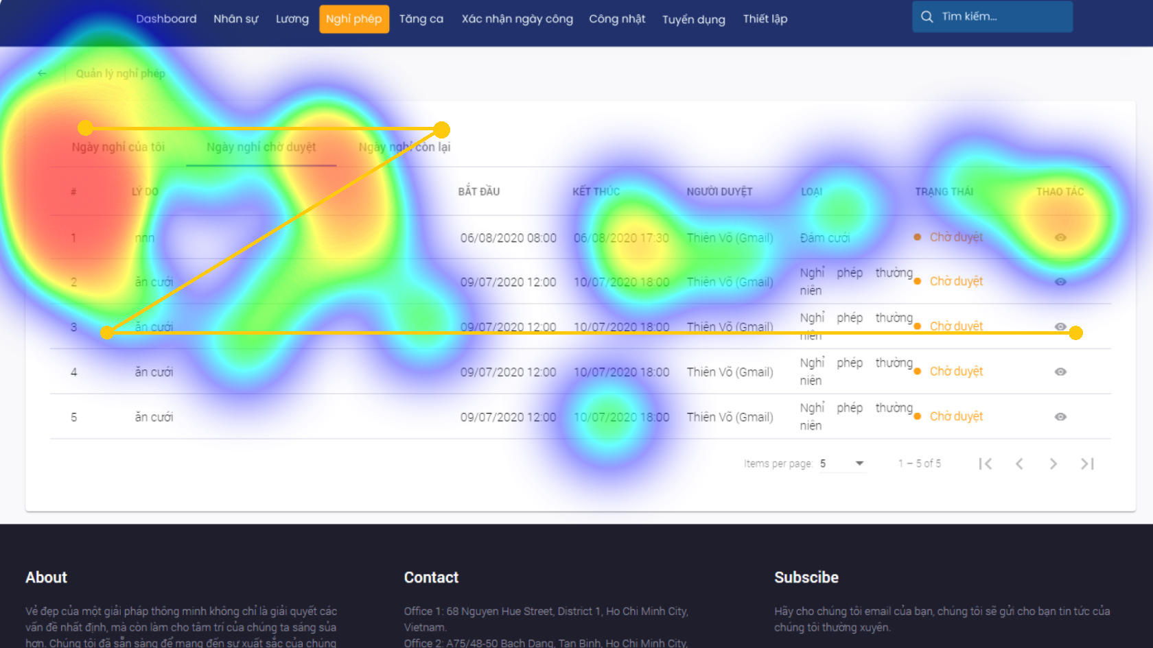
Eyetracking for the old "Leave Page"
How did we survey?
Understanding the target group of users that the system will serve through the survey is also a good thing, right?
After understanding the overall goal of the entire project. In the first sprint, we conduct user surveys to get a project overview of the context, focus groups, required features, user insights, and more.
23
Survey Participants
7
Interview Participants

Quantitative Refection
Key Insights
After the survey, we got some key information.
-
Age rangeThe main Vietnamese working age (25-30)
-
GenderMainly female officers
-
ChannelWord / Excel, Traditional Papers, Gmail, Outlook,..
-
Features Payrolls, Recruitment, Leave Requests, OT, Staff Management,..
Let's Interview
After having focus groups, we need to understand more about user issues. Therefore, the Team conducted different interviews for each target feature in the entire HRM system, at different times.
Below is the process of interview for the "Leave page" features. Interviewers selected from the focus groups will be asked the same questions when dealing with things related to the "Leave" processes. In addition, The team also took advantage of the old HRM (in the previous ERP system) to ask interviewers to complete some tasks. Then, we analyzed their Touch-points, Eye-tracking & Difficulties interacting with that old one for remaking a better "Leave page".
Interview Reflection
-
7/7
Successfully created a leave request.
-
6/7
Don't know how much leave they have left for different types of company leave.
-
5/7
Find it boring because they have to click too many times through different tabs in the current "Leave page".
-
Don't know how many days of paid leave left that i have
-
How are my Leave Requests? my current leave request is accepted or not?
-
Visualize the parameters of different Leave types
-
Solve the problem of leave application status
Time to Define
User Persona
"Human resource management needs to be smarter and more efficient by applying technology products" Binh is an HR officer of a technology company. He has quite a headache with outdated human resource management processes. He wishes to easily solve the processes of working with HR through the use of an optimized HRM system.
-
For some short-term leave applications, I also have to look at each application in detail before it is approved.
-
People applying for leave in the same time frame, which is an inadequacy for the overall performance of the company.
-
Lack of interaction in work between colleagues when they didn't know the leave status of each other.
-
'Fast approval of leave requests' feature.
-
"Conflict warning" with Leave Applications whose leave time frame overlaps with other colleagues.
-
"Leave Schedule" feature for company members

Empathy Map - A Story of Nam Bình
User Journey Map

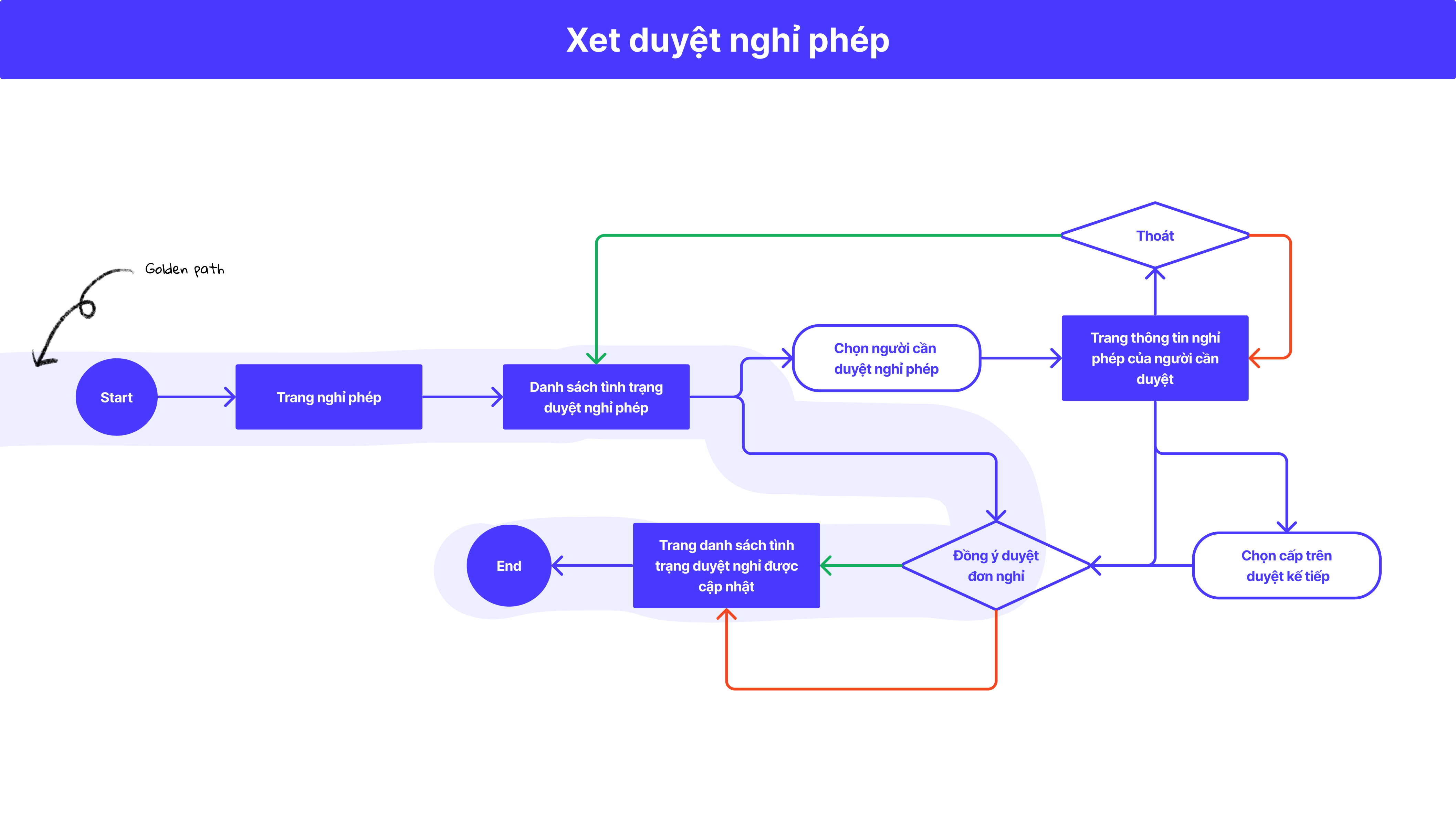
UJM - "Approval of leave requests"
Competitors Audit
Learning about other companies' current products would be more effective when bringing our HRM products to market.
- B***.VN CompanyA formidable competitor to us, they provide a wide range of solutions for businesses not only about HRM
- The other 2 companies are less competitive, because the system is set up quite old, so the interface is a bit outdated, mainly in the form of tables and tabs.
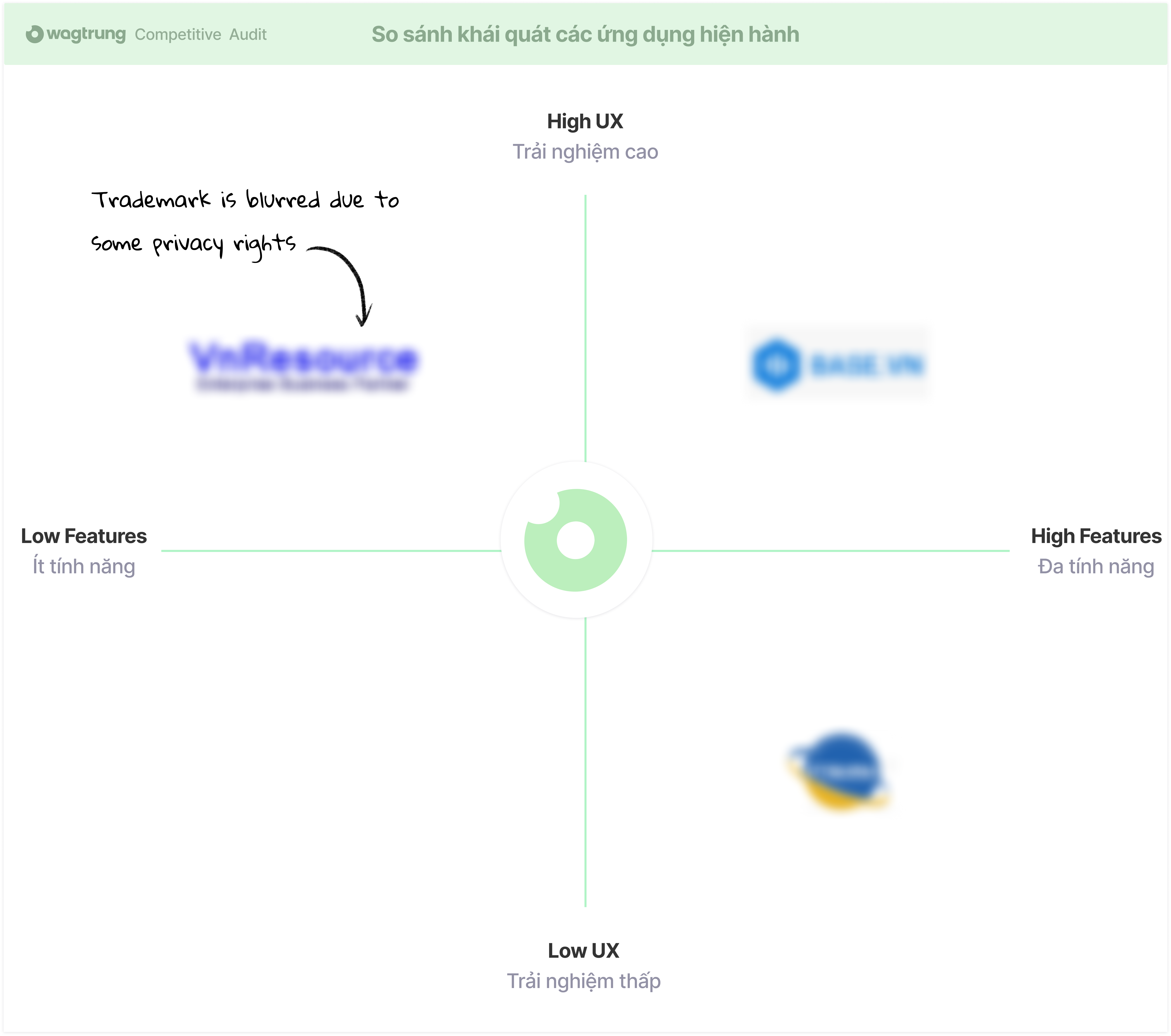
Competitor Analysis
Ideate it now!
How might we ?
- 1 UI page for all "Leave" features to remove tabs and visualize the information immediately when the user clicks on the "leave" page
- "Leave Type (paid/unpaid)" section by using pie charts for different types of company leave. In addition, applying Zeigarnik Effect to show the number of leave types the user has used during the year.
- "Fast approval of leave requests" Button. In some cases just 1 click is enough, it will be a big problem when HR is faced with too many leave requests and they have to click on every single one to accept it.
- Colorize the status of leave applications, so users don't have to wonder about the review status of your leave requests.
- Leave schedule in the company section to connect company members and provide flexibility in allocating work.
Userflow - "Fast approval of leave requests"
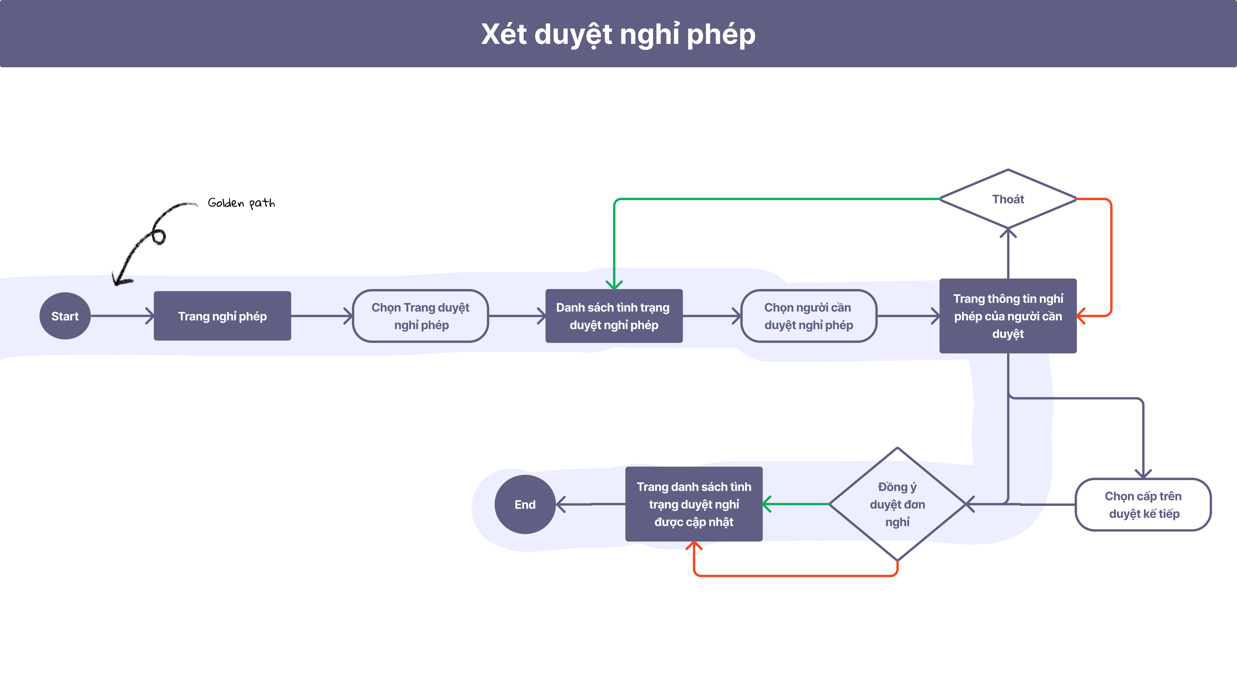
Before
To review an employee's leave application request, HR people have to spend a lot of time to deal with hidden information in the tab and having to click too many times.
-
1 clickon Tab, to reach "List of employees who need to be approved for leave"
-
1 clickon Element, to view the details of each leave request
-
1 clickon Button, to make a decision to accept or reject the leave request or forward it to another manager to check.
After
Everything is visible on one page, no more tabs - no more hidden information. Place accept/decline buttons right next to each employee's leave request and still allow them to click on element to view details if needed.
-
1 clickon Button, to make a decision to accept or reject the leave request
Information Architecture

IA - Leave Request page
Draw & Touch
Visual Design
Color palette
60/30/10
Typography
Major Third (1.25)
UI Components
30+ elements
Grid & Spacing
8pt-grid / 12 Columns
Lowfield wireframe
Our team uses the quick paper wireframe to bring speed and convenience when working in the agile software development process. When things can change in a flash as required by the stackholder, iteration and adjustment is a must.
The Result
Achievements & Learned
At this stage, The team conducts Usability Testing such as:
A/B testing, Heuristic Testing,... to bring
users a stable sample product and minimize basic errors.
Got the prototype done. The HRM product in general and the
"Leave page" in particular, is brought to a sample users to
experience for getting feedbacks, From which the Team
continues to iterate and make other improvements.
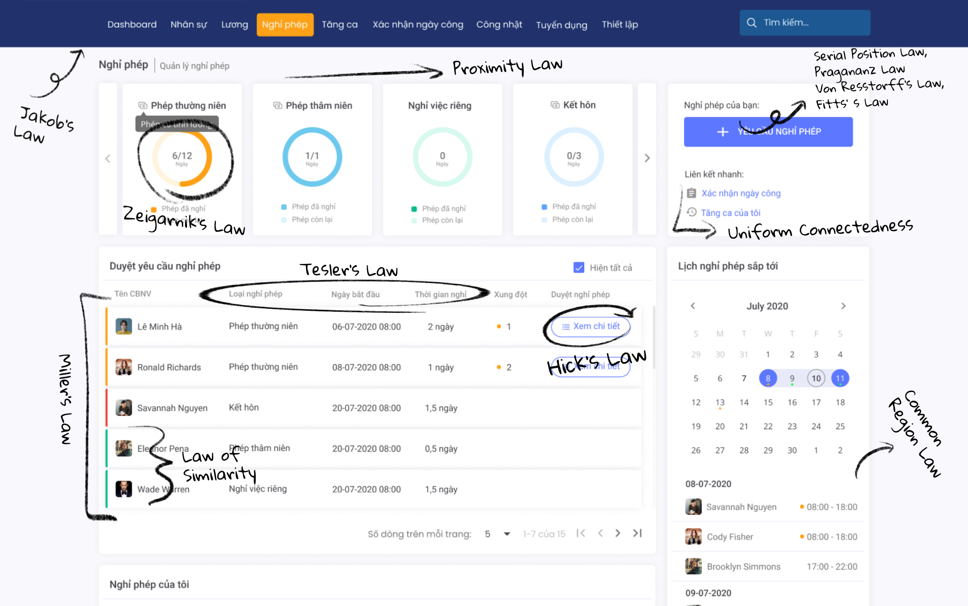
New "Leave Page" - Gestalt principles / UX Laws applied
- 3x fasterwhen 3 tabs information is combined into one page
- High component reusability when developingthis is very useful for developers when developing follow-up pages with similar concepts like: Overtime or workday confirmation page
- Eliminate Heuristic errorsincrease recognition and contextual language synchronization for buttons and display status when the user has manipulated.
- Graph informationcreate good attention and immediately inform users about the number of days off instead of having to look up in a table like in the old system.
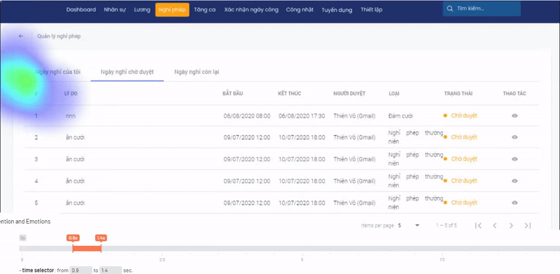
New Eye-tracking testing


Eyetracking for the new "Leave Page"
Finally, Through eye tracking, we see that
users can quickly scan through clearly hierarchical
content
as well as have a greater focus on CTA buttons than in the old
system. Moreover, all information is presented clearly to
increase work efficiency for HR and do not have to redeem too
much as well as find hidden information behind tabs.
the result is extremely worthy. Compared to the
old version of HRM, this new version of HRM which is
re-designed according to the needs of the users, received a
lot of love, not only for the UI but also for the way it
works. It really saves the HR department time.
My Takeaways
For office workers, there are so many requests that need
to be handled on a daily basis.
Reducing clicks by placing a review button right next
to each claim or cut off the tabs sounds simple.
However, it is really a nightmare for HR to go through
more than a dozen leave requests every day, when it is completely unnecessary to go through each
application in detail when only applying for 1 shift leave
or the period of leave does not conflict much with other
applications.
A small change will have a big impact, consider choosing
the most suitable instead of choosing the best. We often
teach each other about user experience (UX), but it is
users in their own circumstances that will teach us how to
solve the system's current problems. Empathy creates high
efficiency without making users think much when using the
product. In addition, it is important to consider the
potential trade-off between financial/technological
resources in product design.
1
Button group
3x
Faster without tabs
1,785
clicks over 4 months
4+
Iterations