Token Design System
Design System
Token-based System with Dark mode & Brand customization.
My Role
DS Executor
Timeline
2023
Team
DesignLab
From
White-label product
Summary
As the product scaled, we moved from a UI Kit to a structured Design System to ensure consistency, reduce duplication, and improve scalability. A token-based approach enabled light/dark mode and brand customization for our whitelabel B2B clients.
About Project
Product Overview
Initially built as a UI Kit, the design became fragmented across multiple Figma files as the product expanded. To solve this, we developed a shared Design System, ensuring seamless sync, branding consistency, and efficient scaling.
The Role
I led the Design System from the ground up, ensuring scalability and brand flexibility. While Tiến focused on desktop UI and Uyên assisted in component building, I drove the token-based system, adapted brand guidelines, and defined component specs. After the first DS release, I continued refining and maintaining updates to keep it evolving.
Problems & Challenges
As the design scaled across desktop and mobile, inconsistencies emerged due to duplicate work and lack of synchronization. Managing multiple Figma files without a structured system led to inefficient updates, higher maintenance costs, and slower design processes.
The challenge was to build a flexible Design System that could:
- Standardize components across different Figma files.
- Support light & dark mode through a token-based system.
- Adapt DS to new brands for a white-label B2B product without requiring major redesigns.
Goals & Objectives
- Develop a comprehensive Design System, covering foundations (colors, typography, spacing…) and components (buttons, modals, forms…).
- Establish a Token Design System to support Brand customization, and enable light/dark mode seamlessly.
- Sync all UI designs in Figma with the DS to optimize design workflows and developer handoff.
The Solutions
Token Designs
1. Token Analysis
Evaluation Criteria for Existing Design Systems (DS) Based on Project Needs
- Light/Dark Mode: Is it supported, and how is it implemented?
- White-Label Adaptability: Can a new brand be applied automatically without manually reassigning tokens in the UI?
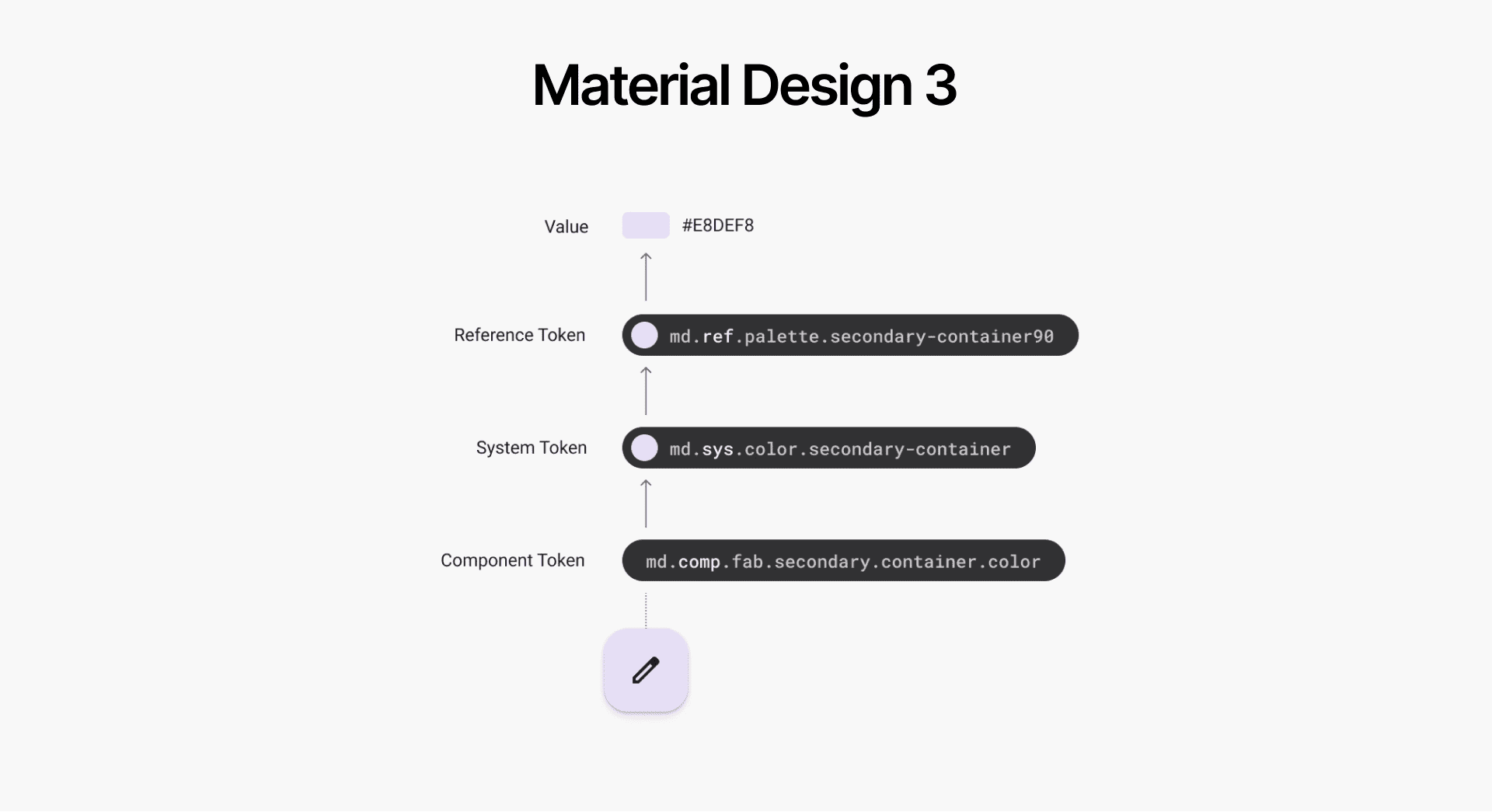
Material Design 3
- Ref Layer: Map to raw hex value, Functional Naming (Primary, Secondary, Tertiary, Error..)
- Sys Layer : Map to Ref layer Key in Light/Dark Mode, Brand-UI Naming (Primary, Surface, Outline,..)
- Comp Layer: Map to Sys layer Key, Component Naming (Button, FAB, Checkbox,...)
PROS
- New Brand Adaptation: Update token raw values without altering key references, as keys in the Ref Layer follow a functional naming convention (e.g., Primary/Secondary) rather than specific colors.
- Light/Dark Mode: Managed at the Sys Layer, switching modes updates key values while keeping everything else intact automatically.
CONS
- Sys-level naming (e.g., primary, on-primary, surface, on-surface) can restrict design creativity during development by enforcing rigid structures, making usage and recall harder. MU3’s DS suits stable products with minimal design changes.
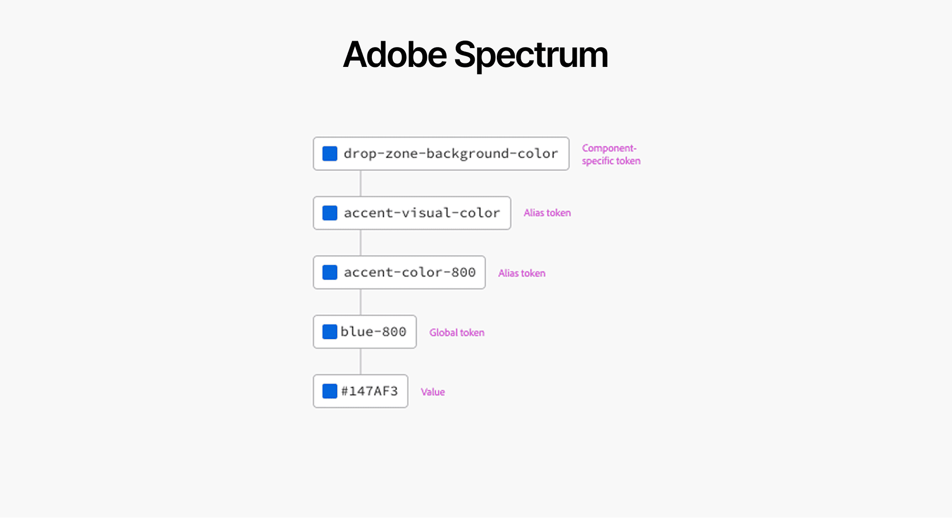
Adobe Spectrum
- Global Layer: Map to raw hex value, Color Naming (Blue, Red, Green,..)
- Alias Layer: Map to Global layer Key in Light/Dark Mode, Brand-UI Naming (Accent, Background, Text,..)
- Comp Layer: Map to Alias layer Key, Component Naming (Button, Toast, Text-field,...)
PROS
- Light/Dark Mode: Managed at the Alias Layer, switching modes updates key values while alias keys are unchanged.
CONS
- New Brand Adaptation: Since the global layer uses color names (e.g., blue, red), updating a brand requires reassigning Alias layer values to new Global Layer keys. Dev remains unaffected, but designers must manually repick alias values in Light/Dark Mode.
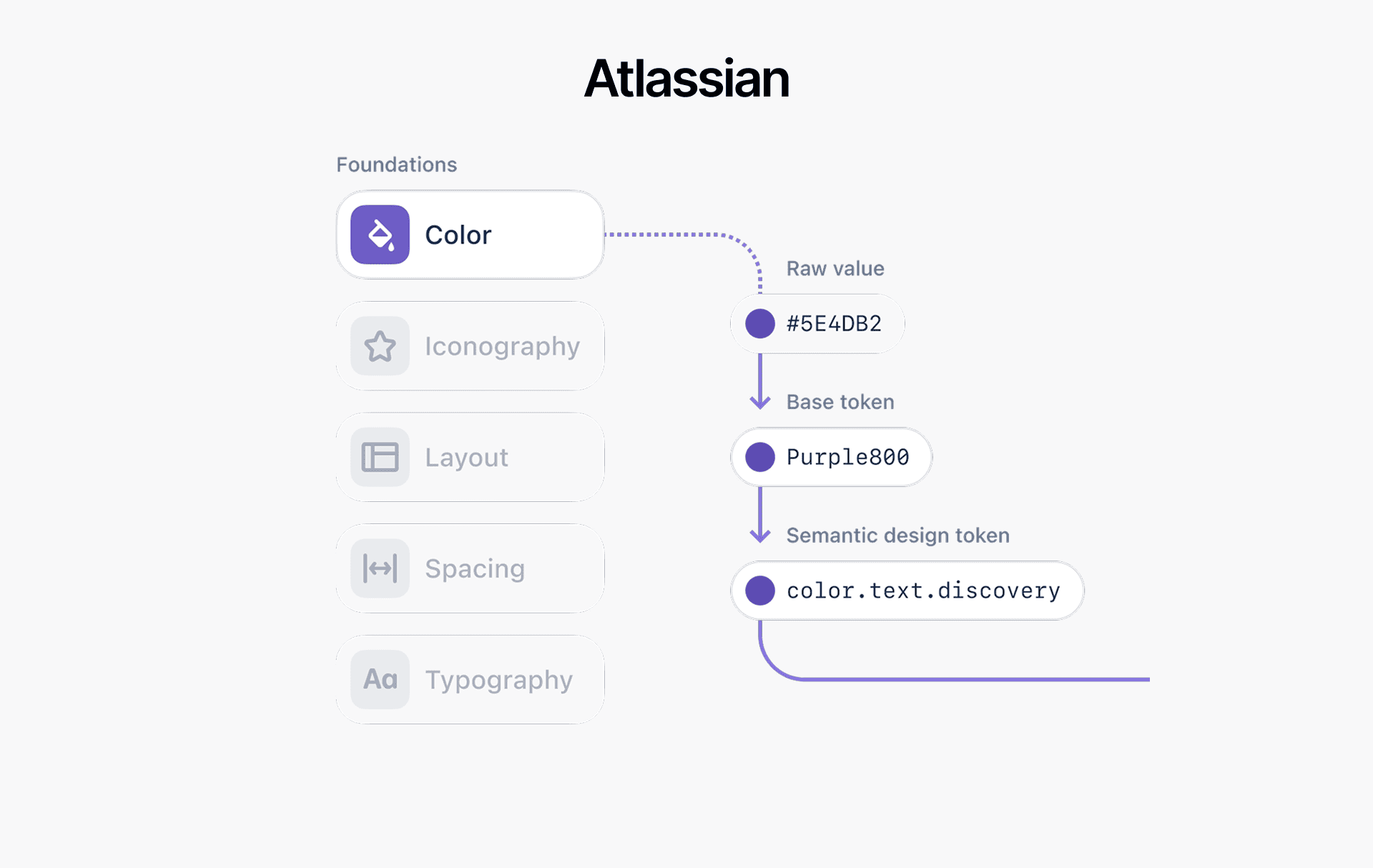
Atlassian
- Base Layer: Map to raw hex value, Color Naming (Purple, Red, blue,..)
- Semantic Layer: Map to Base layer Key in Light/Dark Mode, UI Naming (Text, Background, Border, Icon,..)
PROS
- Light/Dark Mode: Managed at the Semantic Layer, switching modes updates key values while the keys are not affected, so the UI is stable.
- Semantic Naming: Naming based on UI elements (Text, Background, Border, Icon...) enhances flexibility and creativity for designers, removing restrictions on usage. This approach adapts well to both startup products and stable ones, ensuring greater design freedom.
CONS
- New Brand Adaptation: Since the base layer uses color names (e.g., blue, red), updating a brand requires reassigning Semantic layer values to new Base key colors.
- No Component Layer: Suitable for products with minimal component adjustments. However, without it, any UI component changes require manual changelogs and dev updates, instead of automated updates via the component layer in the JSON file.
📌 KEY INSIGHTS
After evaluating leading Design Systems (DS) in the market, it’s clear that each system is tailored to optimize either efficiency or flexibility based on product needs.
- Structure: DS layers range from 2 to 3 levels (Global, Alias, Component)
-
Naming Conventions:
- Layer 1: Named by color properties (red10, green100, blue900) or functional brand/state (primary10, secondary20, error100).
- Layer 2: Named by UI function (text, background, border) or brand/state attributes (primary, info, warning).
- Layer 3: Named by specific components, following a prefix order from foundation base (color, elevation, font). Ex: button-primary-default-background-color or color-button-primary-default-background
2. Our Solution for White-label DS
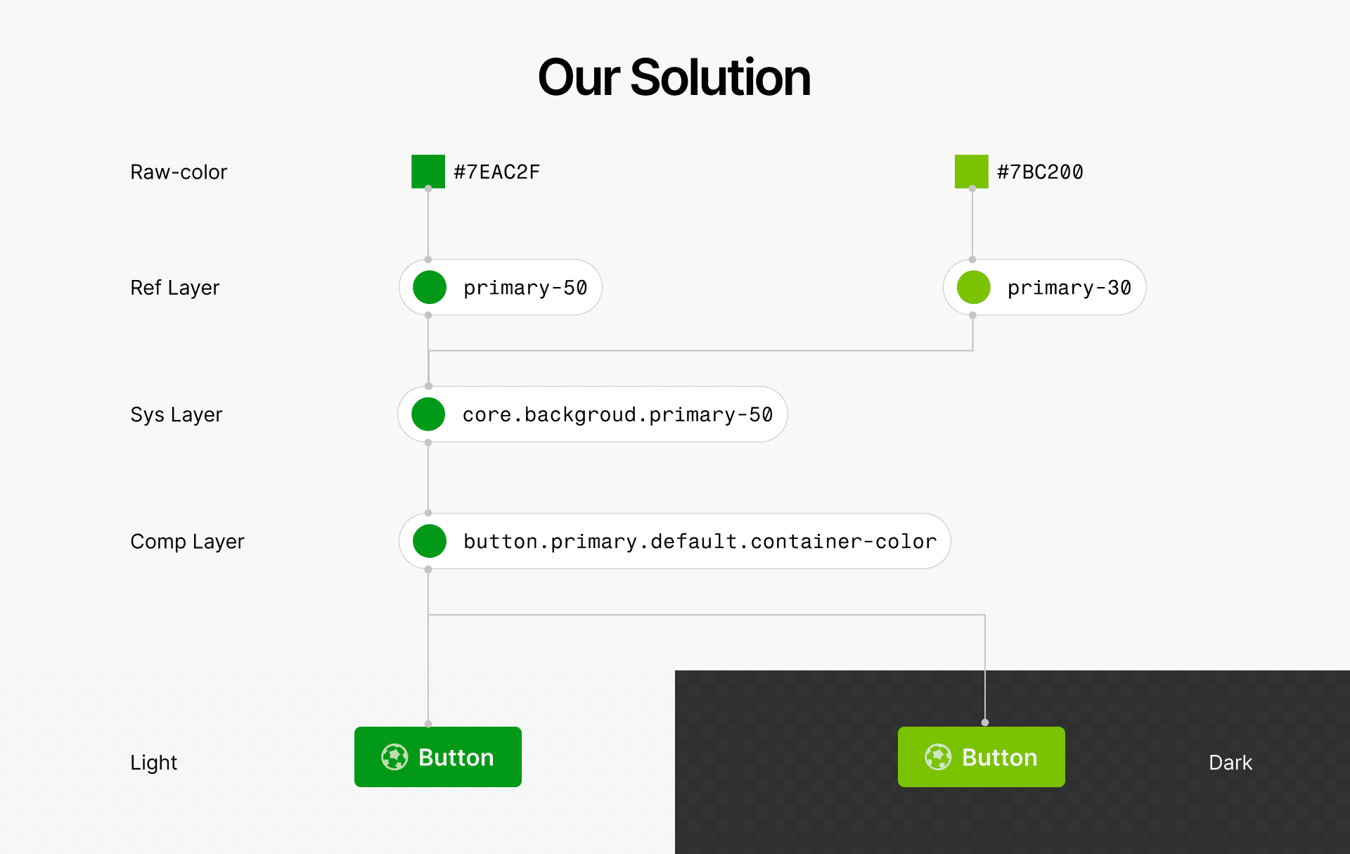
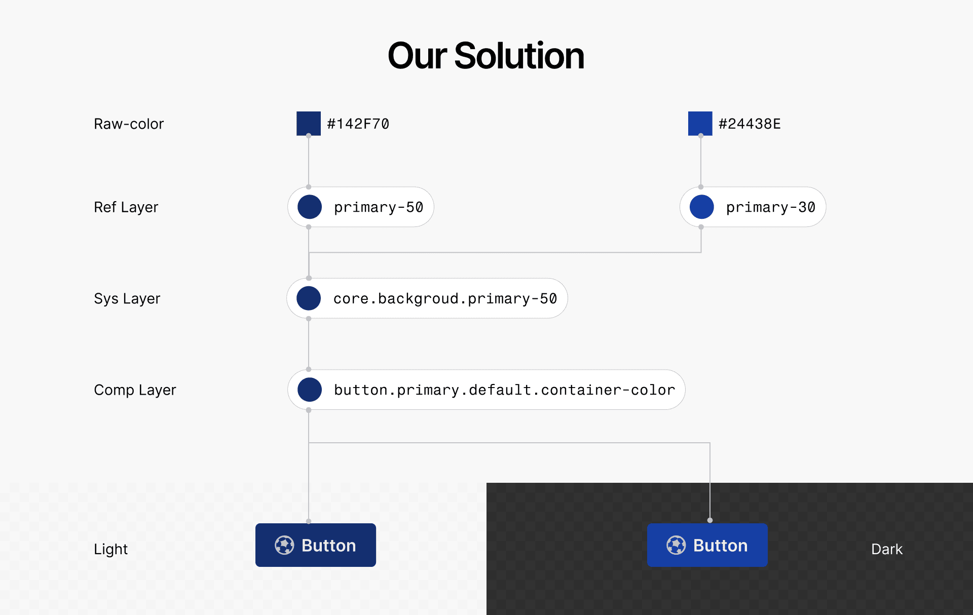
- Supporting brand customization by using Functional naming (e.g., Primary, Secondary) in Ref Layer avoids rearrangement of key token.
- Simply switching Light/Dark modes updates values while key tokens remain unchanged. Sys Layer naming as UI function for flexibility in design.
- No dev effort is needed for Component changes, as every changes syncs automatically via the Token JSON files when exported.
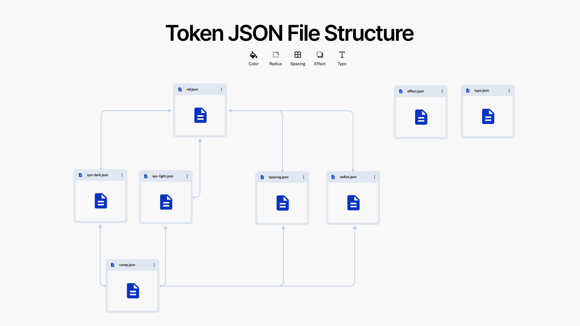
Our Token Structure JSON File
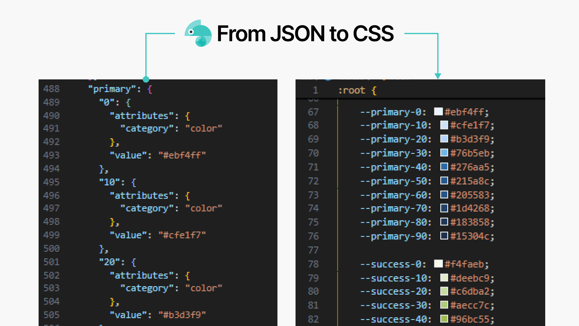
Parsing JSON to CSS
Building Components
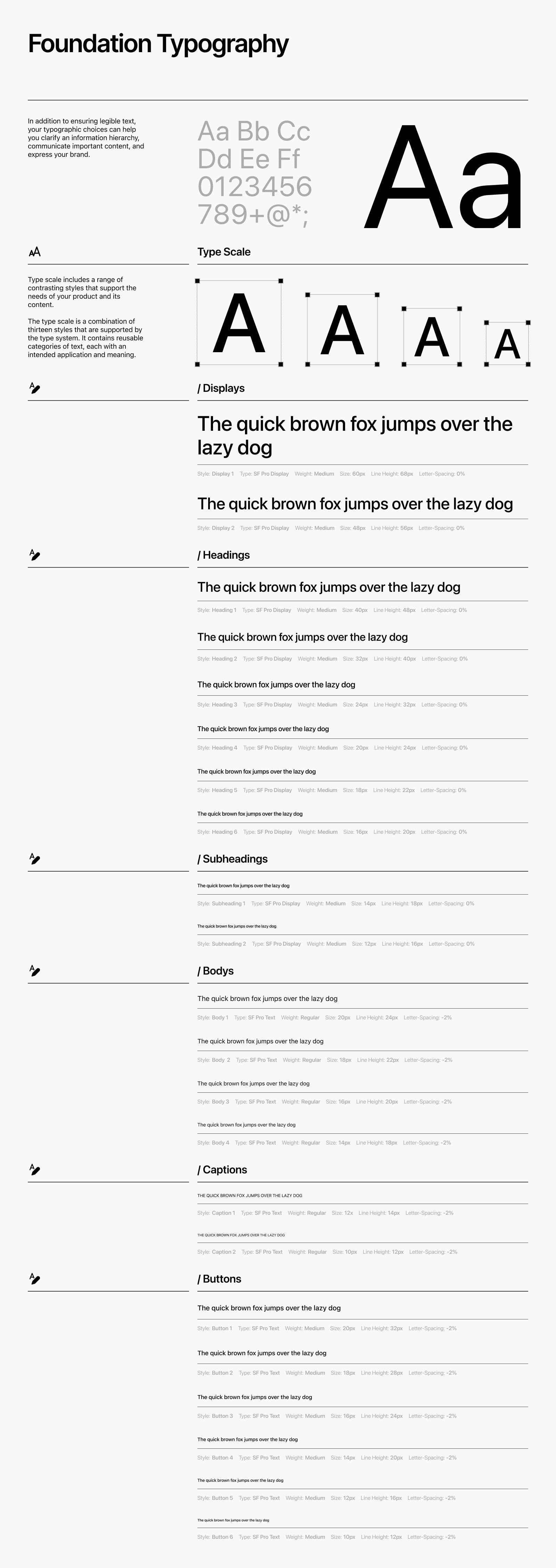
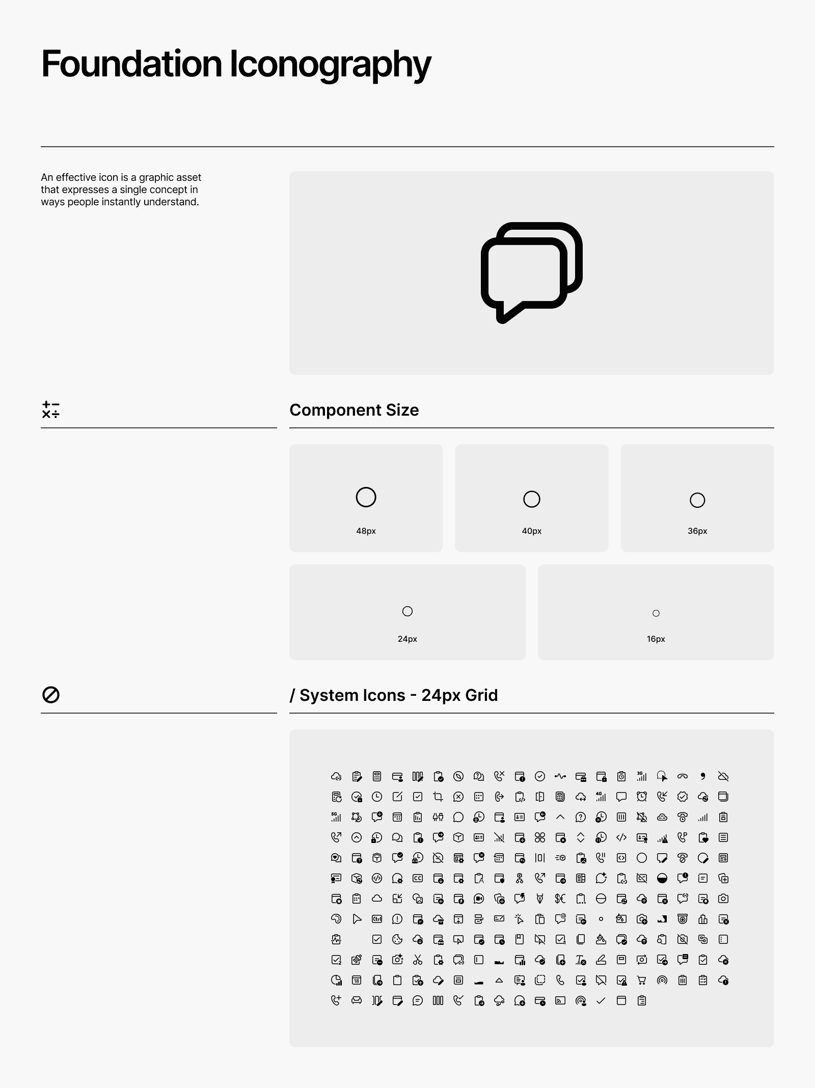
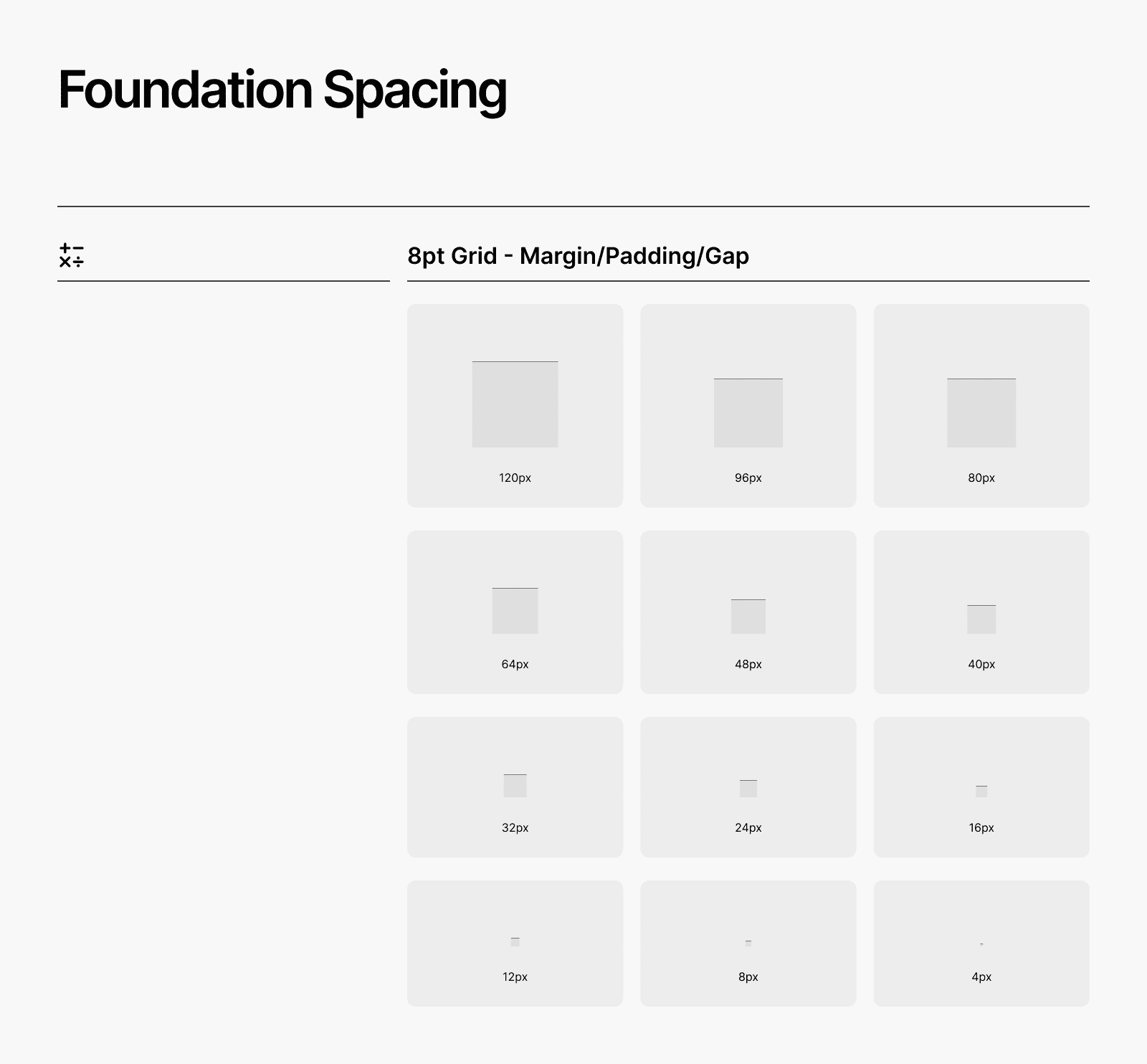
1. Foundations
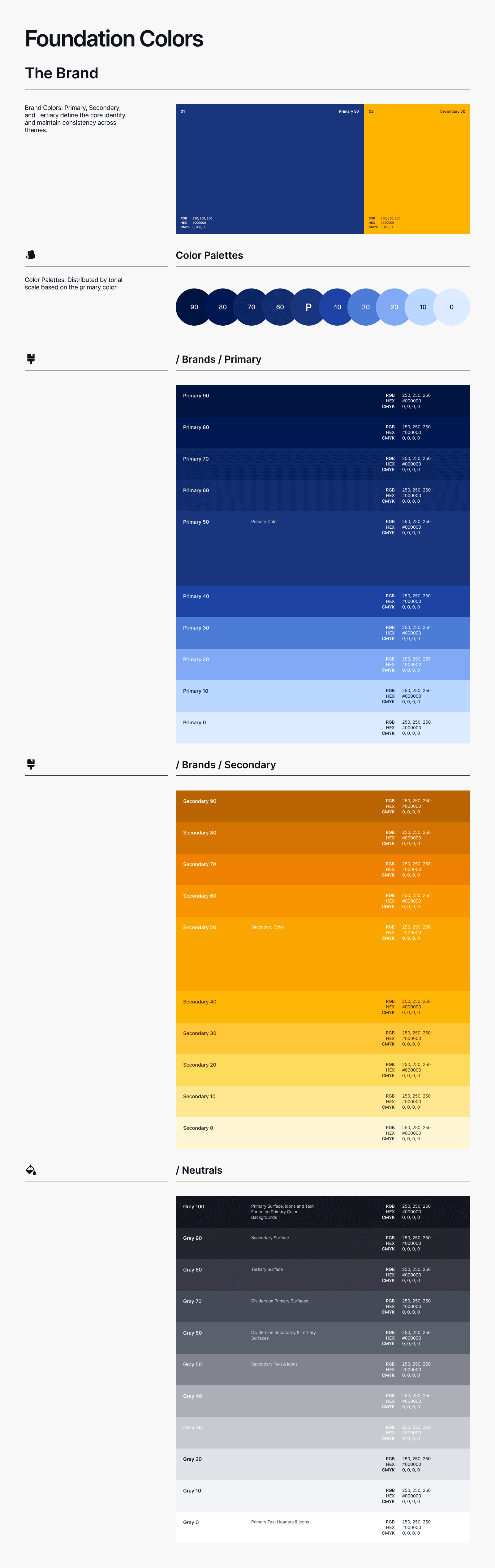
Established core elements like typography, color, 8pt Grid - spacing, and elevation to ensure consistency and flexibility across the system. This also included defining design tokens to support light/dark mode and Brand customization.
Foudations System
2. Components
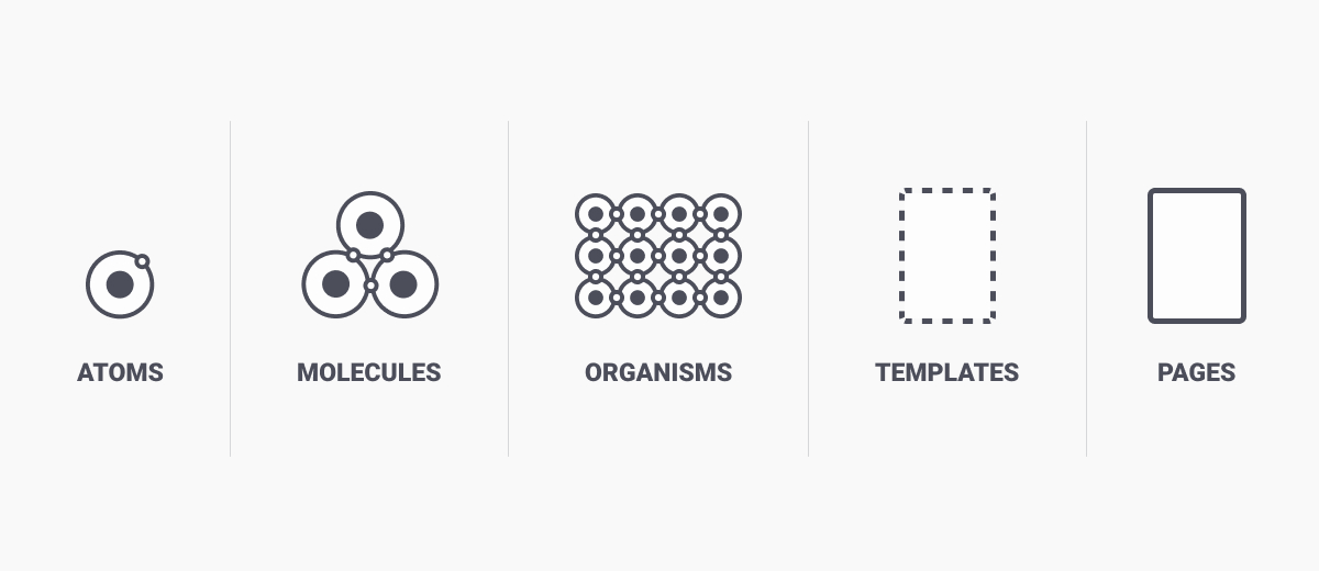
Built essential UI components by Atomic Design with variants for different states (default, hover, pressed, selected, disabled) and apply slot for flexible positioning.
List of Components
Buttons,Text fields, Dropdowns, Checkboxes, Radio buttons, Toggles, Date & Time Pickers ,Standard Modal, Confirmation Dialogs, Bottom Sheets,Breadcrumbs, Tabs, Pagination, Alerts, Toasts, Tooltips, Popovers, Avatars, Badges, Loading, Skeleton States, Progress Indicators.
Guidelines Specs & Anatomy
Documented usage guidelines, anatomy, specs. Every component was structured with clear constraints and customization options, ensuring easy implementation without breaking consistency.
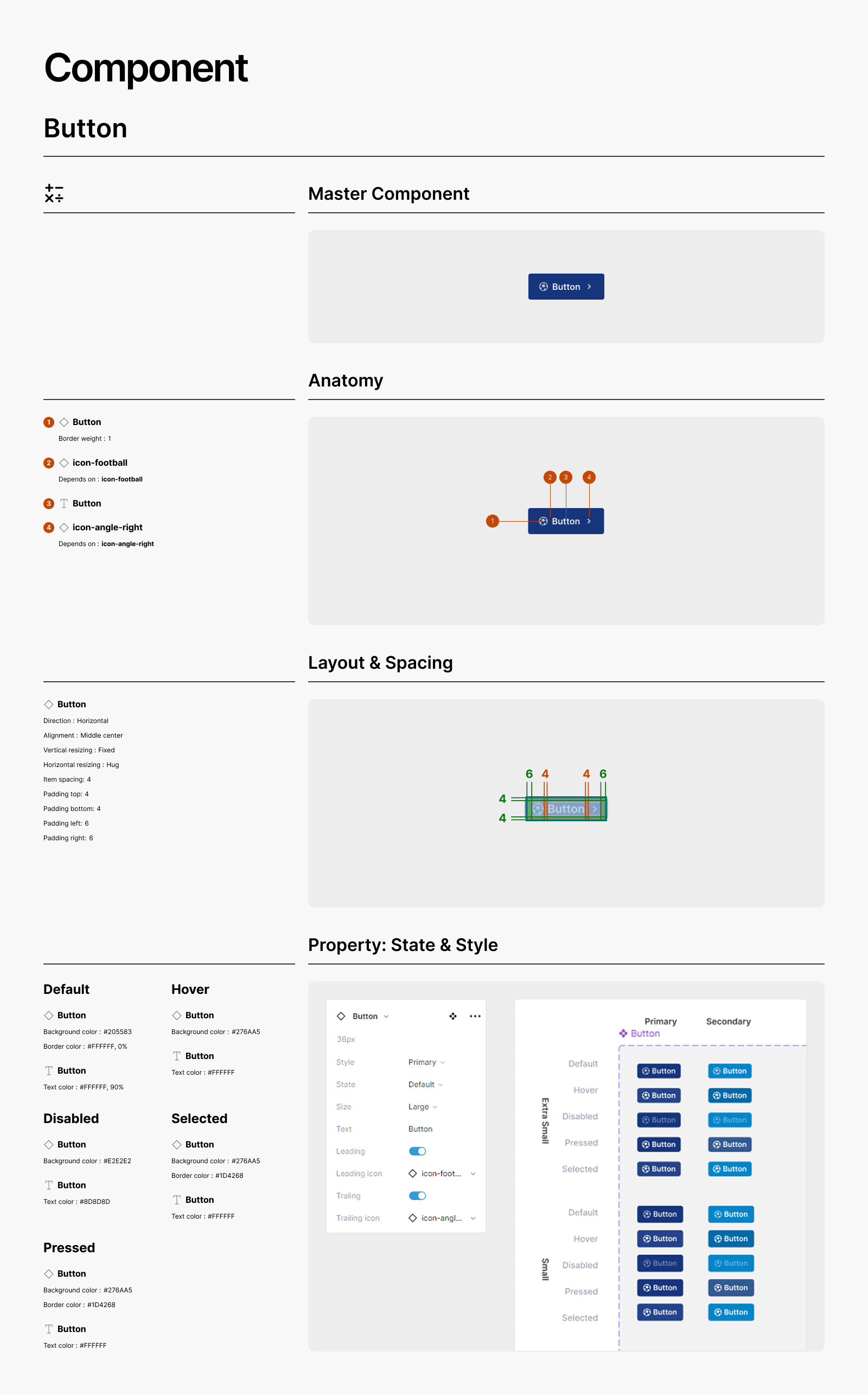
A Button Component Design
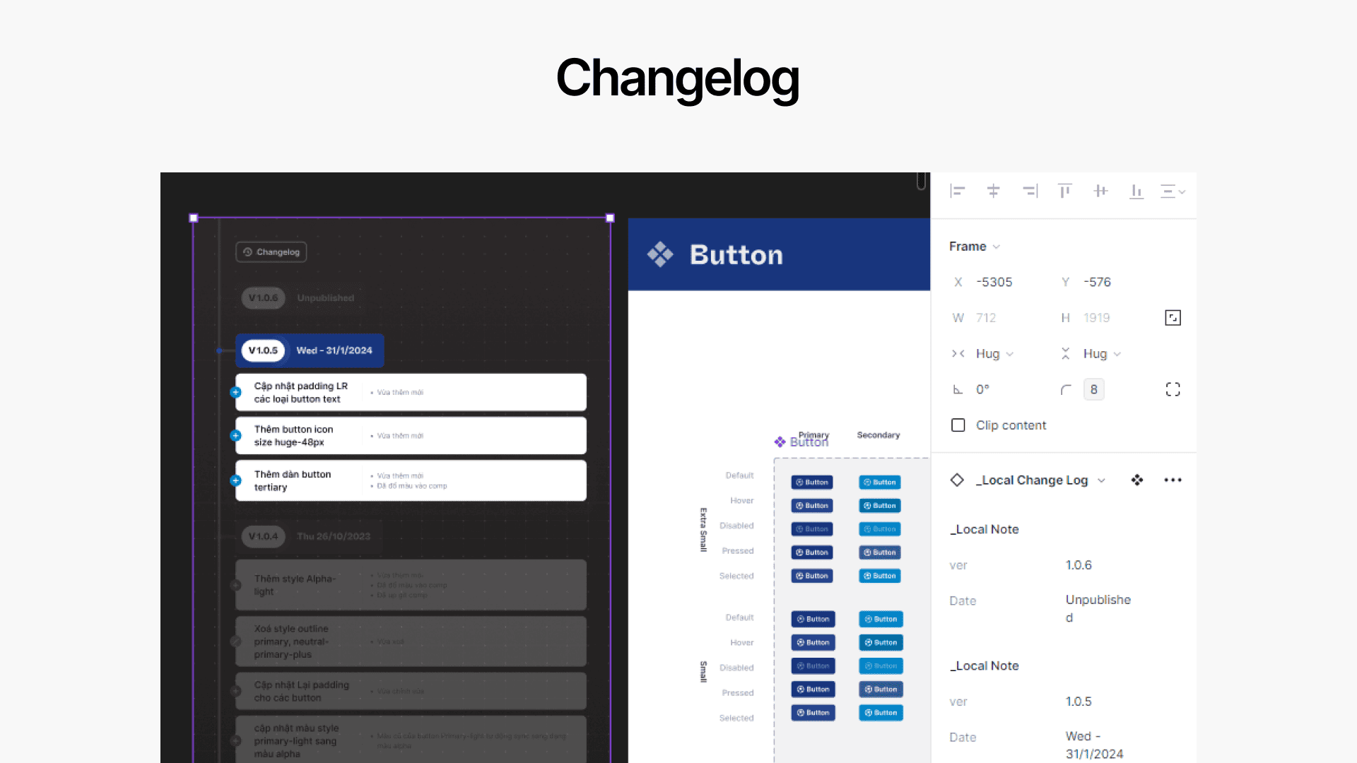
Update component changes upon DS release.
The Results
3x Faster Design Workflow
With the new Design System, designers can deliver UI components 3 times faster by eliminating redundant and unsynchronized work. No more recreating components manually.
50% Reduction in Development Time
Developers no longer need to manually adjust colors, spacing, or typography based on lengthy changelogs. All updates are automatically synced via Token JSON files pushed to GitLab, significantly cutting down revision time.
Just 1 week for White-Label Adaptation
After launch, a client requested a brand adaptation. The default navy theme seamlessly switched to their green with minimal effort. In just one week, designers fine-tuned contrast and tokens, while developers avoided manual color updates—something impossible before the DS.