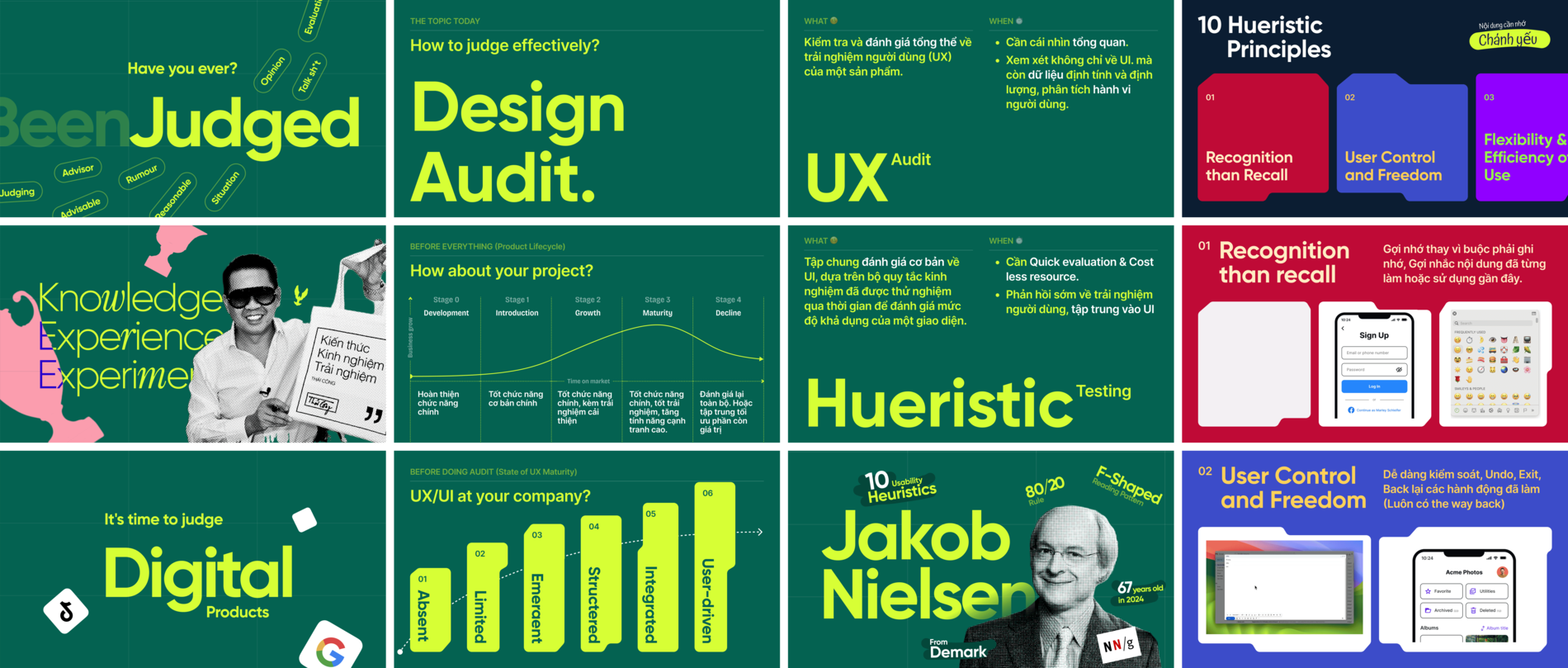
Design Audit
Game UI Template
Revamped the embedded UI for games via heuristic evaluation.
My Role
Product Designer
Timeline
2024
Team
DesignLab
From
Game Platform
Summary
A leading game provider wanted to strengthen brand recognition across their embedded UI elements while improving usability and consistency across their all games. Our task was to audit, refine, and optimize these UI components for better accessibility, adaptability with a dynamic color token system, allowing effortless game theme adaptation without extra development effort, and mobile responsiveness.
About Project
Product Overview
This project was part of an initiative to enhance the embedded UI elements within the provider’s existing games. The objective was to improve navigation efficiency, ensure visual consistency, and strengthen brand recognition across their portfolio. By refining in-game UI components—such as buttons, modals, and in-game panels—we aimed to create a cohesive and seamless experience without altering the core game design.
The Role
I took full ownership of this project, starting with evaluating the existing UI based on heuristic principles and UX laws. From there, I proposed solutions at both the micro and meso levels, ensuring usability and consistency across embedded UI components. I was also responsible for executing the redesign and delivering the final solution to the client.
Heuristic Evaluation of the Existing UI
We conducted a heuristic evaluation and found that:
- UI inconsistencies across games disrupted the user experience.
- Lack of scalability, requiring manual adjustments for each new integration.
- Brand recognition was weak, as UI elements didn’t reinforce a unified identity.
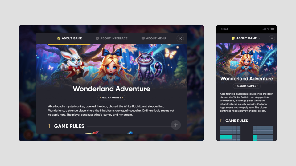
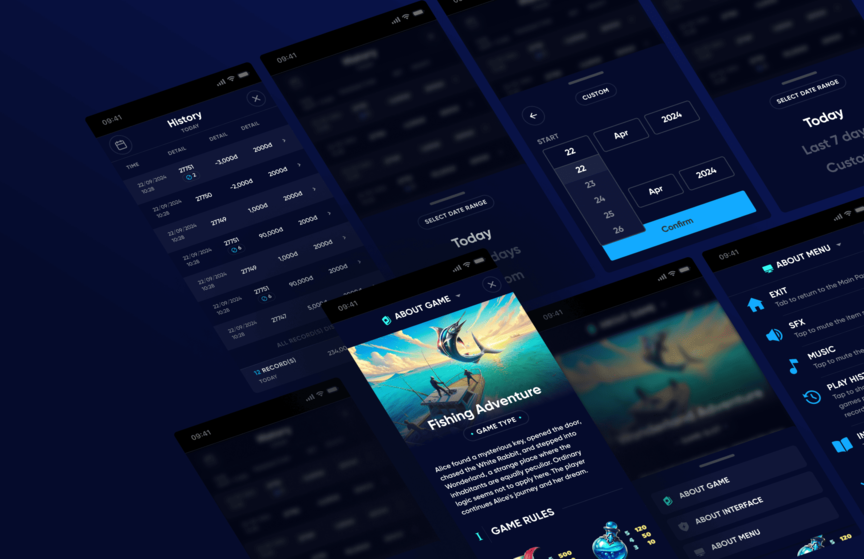
One of the current UI before Design Audit
Goals & Objectives
- Improving systematization, not relying on one-off adjustments per game.
- A scalable UI approach for future expansions.
- flexible theming solution was needed to adapt UI elements dynamically without heavy rework.
The Solutions
Pre-Audit Analysis
1. UX Maturity Assessment
- The team was at an emerging UX maturity level (Stage 3), meaning resources were limited for extensive research.
- We prioritized a Heuristic Evaluation at both micro and meso levels to address usability and consistency, rather than conducting a full-scale UX audit with complex usability testing.
2. Product Life Cycle Analysis
- The product was in the Growth & Maturity stage (Stage 2 & 3), requiring both brand consistency and expansion.
- Our solution needed to: strengthen brand recognition across all embedded UI elements. Improve usability and scalability for future expansions. Ensure a consistent experience, making the product more recognizable and easier to navigate.
3. Applying Heuristic Principles
We discovered & applied Jakob Nielsen’s 10 Usability Heuristics & UX Laws to identify usability gaps and optimize the experience.
Style & Art Direction
After conducting a competitive analysis of other game providers, we identified that dark themes and blur overlay were commonly used across the industry.
- Maintaining Domain Consistency to avoid alienating users with a drastically different style, we aligned our UI aesthetics with industry standards.
- Implemented a design token color to allow dynamic theme adaptation per game.
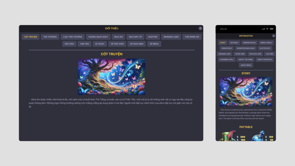
New Design Direction after audit with flexible theme for different games.
Heuristic Proposal
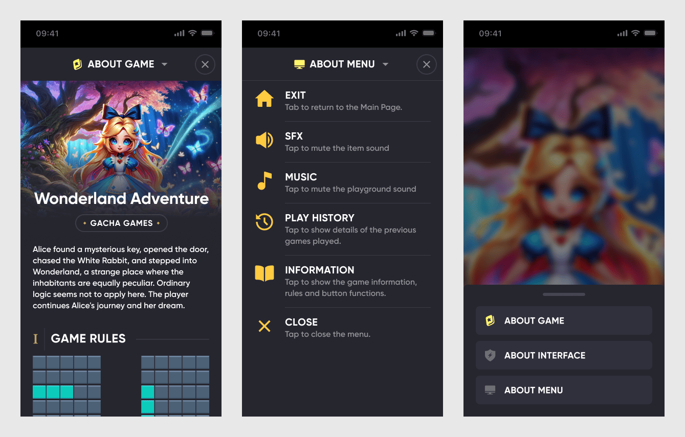
1. Micro-Level Improvements (Component-Level Enhancements)
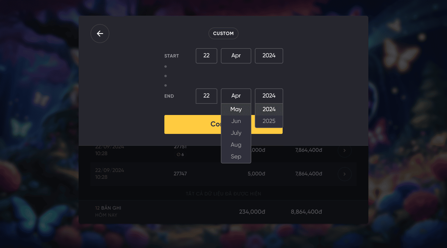
- Maintaining familiar industry component patterns like datepicker, reducing the need for users to relearn interactions.
- Implemented a design token system to allow dynamic theme adaptation per game.
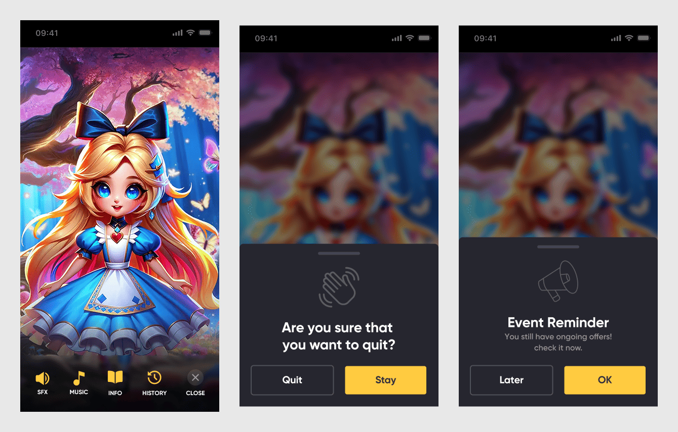
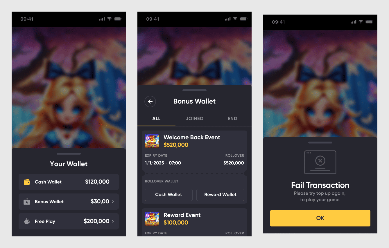
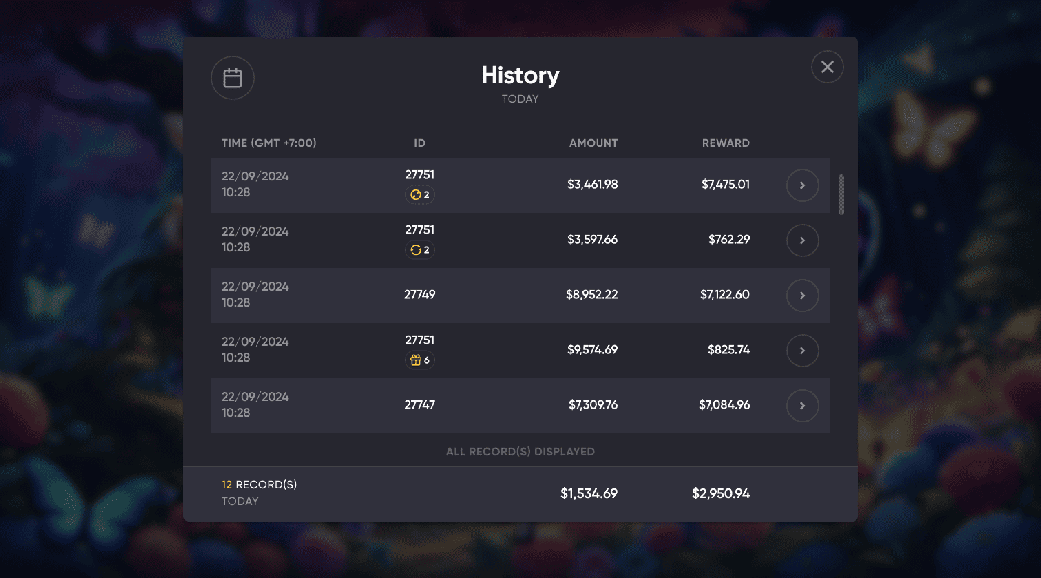
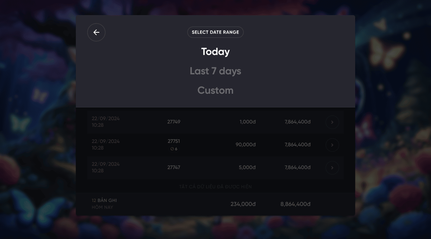
- Refined visual hierarchy and spacing for improved readability and usability. On mobile, key interactions were shifted to a bottom sheet for a unified, intuitive experience.
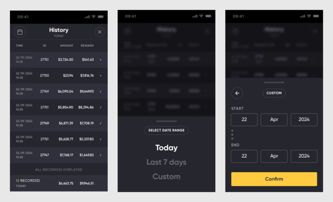

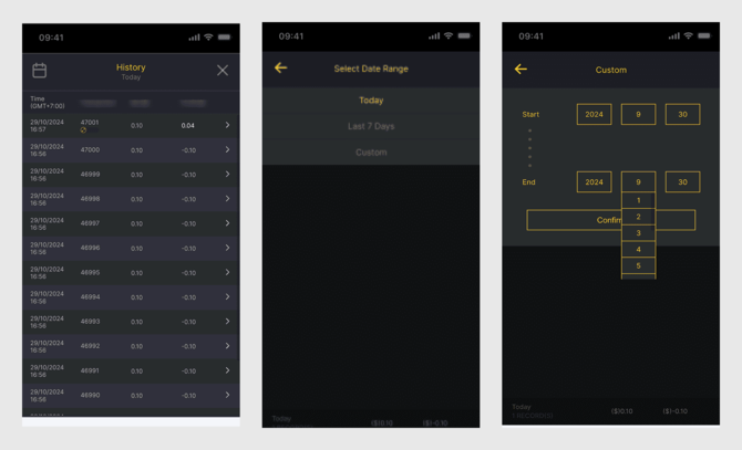
Old vs New Design in Game History Template Flow.
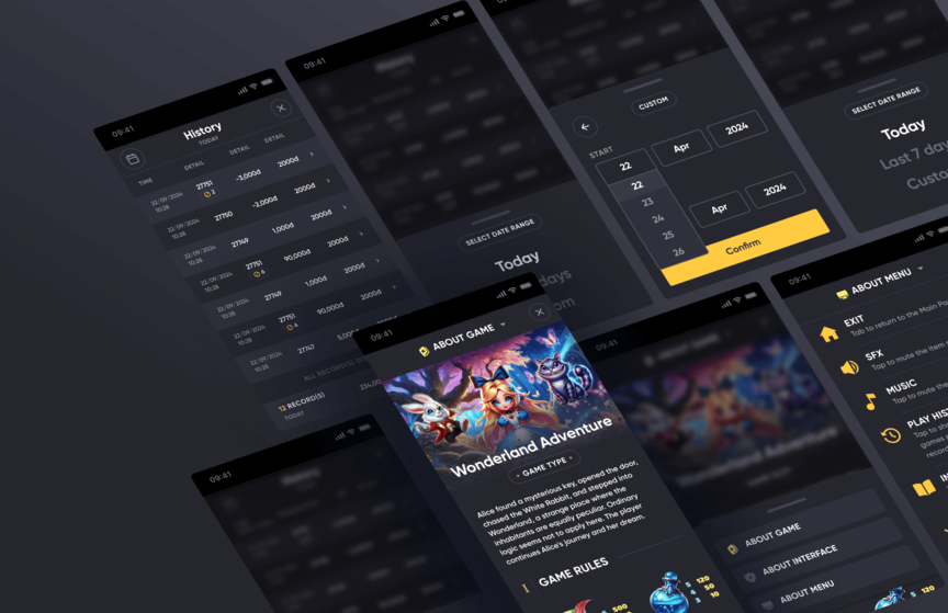
Other UIs on Mobile after Design Audit
2. Meso-Level Improvements (Flow UX Enhancements)
We made sound controls instantly accessible, eliminating extra steps. Game details were restructured into three sticky sections for effortless navigation. The date picker was arranged and formatted to match East Asian reading habits, making interactions feel natural.
Other UIs on Web after Design Audit
The Results
Outcomes
New games adopted the UI 40% faster, The design token system allowed seamless multi-theme customization.
By systematizing the embedded UI, we improved efficiency, consistency, and adaptability, ensuring a smoother experience for both game developers and players.
Takeaways
We foster a culture of knowledge sharing, where team members regularly exchange insights on various topics. After completing the design audit, I leveraged this culture by organizing an sharing workshop about Design Audit.
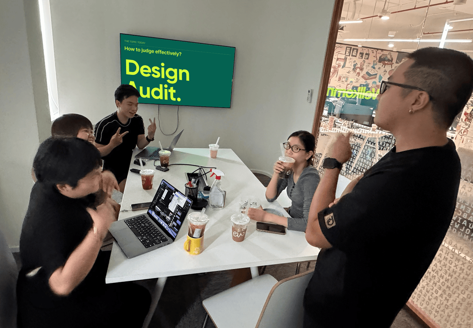
Sharing moment, after a successful Design Audit with my Team.
Instead of my one-way presentation, I designed a quiz to engage the team, encouraging diverse perspectives and deeper discussions about the topic Design Audit. This not only strengthened our collective understanding of the product but also reinforced collaboration and a shared UX mindset.